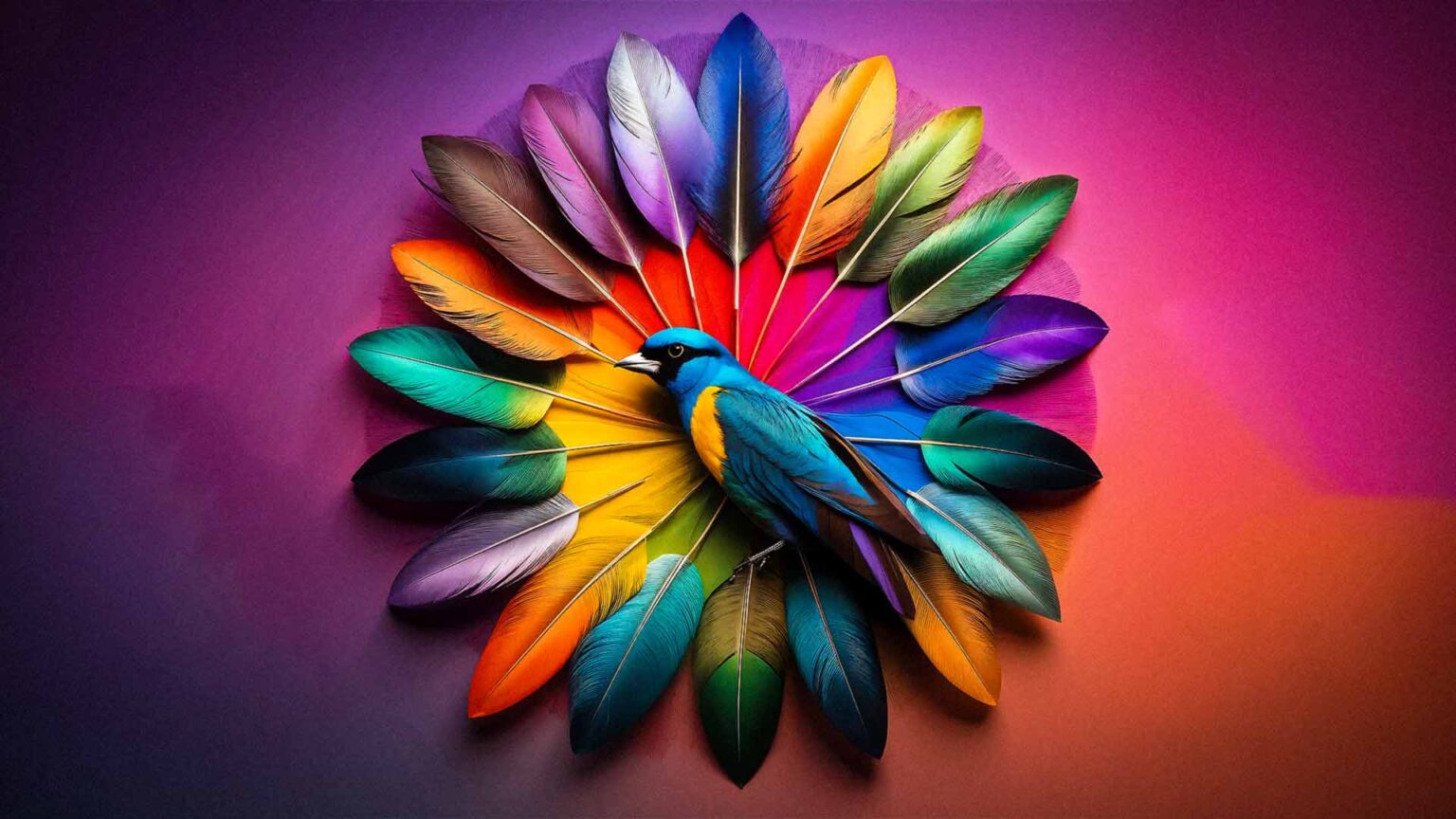
Understanding the Psychology of Color
Color psychology explores how color affects people’s feelings and actions. Various colors can trigger unique reactions, swaying mood and choices. This knowledge is vital for businesses seeking to get why color influences people and use it in their branding and marketing. Picking colors that reflect their brand and what their audience prefers can help businesses better share their story, spark the right feelings, and boost their brand image. This careful color choice strategy can boost a company’s standing and set them apart in a competitive market.
Color psychology of Red

So, red. It’s more than just a color. It packs a punch, sending out waves of passion and energy, grabbing our focus and urging us to move. It sets off emotions and hints at life and a buzz of activity.
The energetic and lively red logo of Coca-Cola symbolizes cheerfulness, mirroring the brand’s energetic charisma. In the same vein, Target uses red to spark thrill and inspire spontaneous buying, generating a feeling of immediacy and longing in shoppers.
Color psychology of Blue
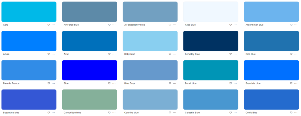
Blue symbolizes faith, steadiness, and skillfulness. This is why it’s a top pick for brands aiming to portray dependability and trustworthiness. It ignites emotions of tranquility and safety.
Looking at IBM, their blue logo sends a strong message. It stands for trust and new ideas, branding them as dependable tech leaders. Facebook uses the same color. They aim to produce trust and bond with people using their platform, creating a feeling of reliability and community vibes.
Color psychology of Yellow
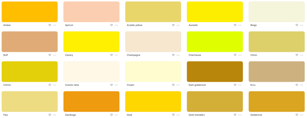
Yellow expresses warmth, cheer, and hope, offering a positive and friendly feeling. It catches the eye and sends a signal of being open and inviting.
Look at McDonald’s golden arches, they’re like a beacon of good vibes and pocket-friendly food, beckoning folks for a merry meal. IKEA goes for yellow, it’s all about warmth and openness, making folks feel easy and stoked while they’re browsing..
Color psychology of Green
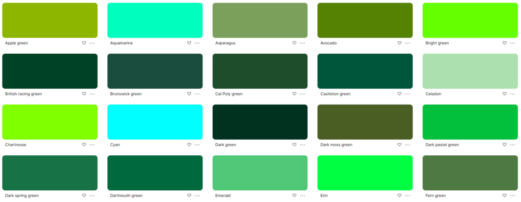
Meaning: Green is linked to all things natural, peaceful, and poised. It’s the color of wholesome wellness and lasting freshness. It stands for rejuvenation and equilibrium.
Starbucks promotes fair trade and earth care through its green emblem, attracting customers who care about society. By using green in its brand, Whole Foods Market signals health and energy, presenting itself as a reliable place for organic and natural items.
Color psychology of Purple
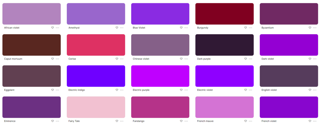
Purple, it’s a color of luxury and creativity. It’s special, unique, hints of elegance. You see it, you think “prestige”. “Creative”, too.
Cadbury uses purple wrappers. It suggests fancy and good-quality chocolate. People who want top-notch chocolate love this. Hallmark also uses purple. It suggests creative and emotional ideas. People who want deep, thoughtful connections like this.
Color psychology of orange
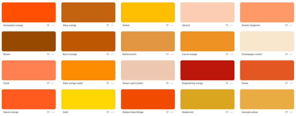
Orange symbolizes energy, fun, and exploration. It’s perfect for companies wanting to stand out. This color boosts both excitement and creative thinking.
Home Depot uses orange in its logo to stir up vigor and spark, making customers eager to start home makeovers. Similarly, Nickelodeon uses the same color, orange, to connect with the young crowd, setting up an enjoyable and exciting mood for kids and teenagers.
Color psychology of Black
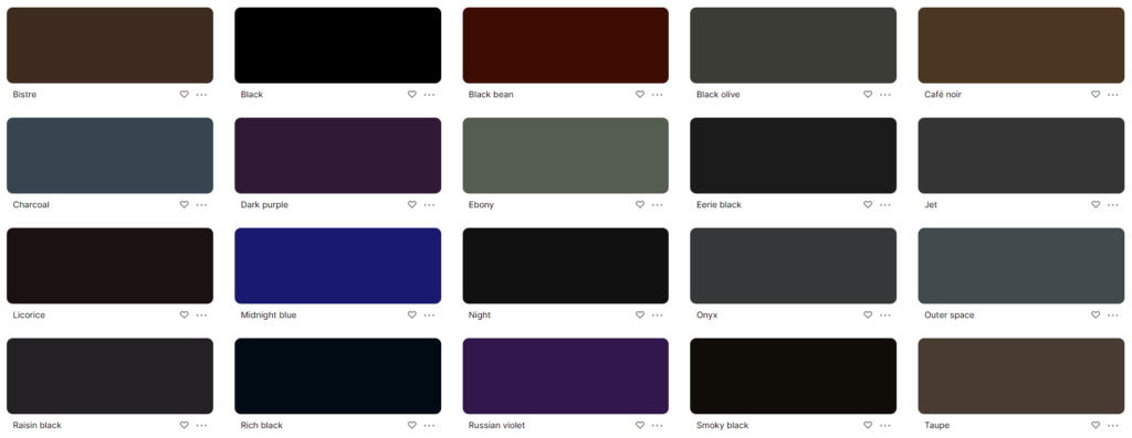
Black is a color of strength and refined class. It stands for qualities like authority and honor. It’s also associated with elegance and finesse.
Chanel’s black-and-white colors spell out poshness and elegance. The brand stands as a classic symbol of taste and finesse. Rolex’s black color hints at the reputation and exactness of its watches, attracting those clients who prize excellence and skill.
Color psychology of White
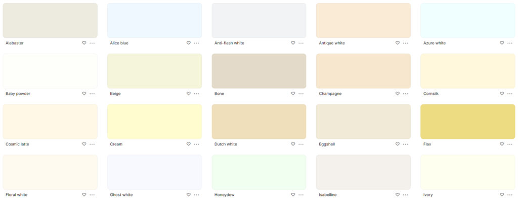
White stands for pureness, plainness, and refinement. It brings clearness and class. It showcases neatness and flawlessness.
Apple’s simple, tidy designs show creativity and class, mirroring the brand’s devotion to ease and charm. Adidas’s white color scheme signifies straightforward design and efficiency, underlining the brand’s concentration on value and utility.
My Final Words
Getting the gist of color psychology helps businesses craft effective brand images that hit home with shoppers. When colors are cleverly used in branding, firms can stir up certain feelings, build relationships, and pave the way for success amid market rivalry.
Additional Resources
If you are Seeking for Graphic Design Inspiration You can look these amazing Instagram Profiles to get Inspiration
55 Best Graphics Designers On Instagram
My favorite Color Swatches generators
Coolors
